Brand identity
The marks, colours, type and voice of Mayfair Grand Residences, gathered in one place for everyone who works with us.
The logo
A Bodoni wordmark beneath the may blossom. Use the stacked logo wherever there is room, the horizontal logo in headers, and the seal for stationery, plaques and wax. Never redraw, stretch or recolour the marks outside the palette below.
 Primary logo on night
 Primary logo on stone
 Horizontal logo, for headers
 Horizontal logo on stone
 The seal, for stationery and plaques
 The seal on stone
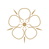 The emblem, the may blossom
 Solid mark, for small sizes and icons
Colour
Grosvenor night and Portland stone carry the pages. Champagne gilt is used sparingly, for the emblem, hairlines and the one detail that should catch the eye.
Typography
Bodoni Moda, with its optical sizes, for every headline and name. Jost for reading, labels and everything practical.
Mayfair, beautifully prepared.
Headlines from 28px, set tight, never in capitals except the wordmark.
Private serviced residences between Hyde Park and Mount Street.
Text at 17px with generous leading. Labels at 12px, tracked.
Voice
Warm, exact and brief, in British English. We write the way a good concierge speaks.
We do
- Name homes by their name and their area, never their street
- Write times as 16:00 and dates as 14 November
- Use full stops and commas where others reach for dashes
- Describe what a room has, plainly and precisely
- Quote guests word for word, with their name and month
We never
- Use hyphens or dashes in anything a guest or owner reads
- Write stunning, nestled, boasts or unforgettable
- Use exclamation marks
- Invent a rating, a review or a number
- Show a room that was not photographed for real
Photography and film
Our homes are always photographed for real, in daylight, with verticals straight. No tints, no filters and no words over a photograph: legibility comes from layout. London film is used for the city, never to stand in for a room.
Motion
Motion explains and never decorates. Headlines rise from a mask, photographs open from their frame, and the hero film opens from a circle as you scroll. Everything respects reduced motion settings.
Booking platforms
Platform logos are shown in one colour, at equal visual weight, in the order below.